Hello, People!
If you know me long enough, and – more importantly – you remember my rants well enough – which I hope you don’t – you may know that watercolours and I are mortal enemies.
Okay… I admit it! We have never actually tried to kill each other, so I probably am exaggerating. Slightly!
But we certainly don’t get along.
The Bunny Messed Up – Repeatedly
I’ve tried several brands and several kinds of watercolours over the years. Watercolour pencils, liquid watercolours, traditional pan watercolours… I’ve also tried different kinds of paper, hoping that perhaps this paper or that paint would finally make the bloody things understand what I wanted them to do.
Nope!
And, just to be clear, I’m not saying that all those watercolours were rubbish. Seriously, not! There are so many watercolour artists doing amazing things with them, clearly showcasing the medium isn’t faulty. It’s simply that watercolours and I have very different opinions about what we should be doing.
For example, one of my recurring problems with traditional watercolours was trying to darken an area.
I’d apply more paint to the part I wanted darker and, somehow, the bloody thing would get lighter, while everything around it became darker.
“Aha! I got what you’re doing now!”
So, next time, I applied the darker paint next to the area I actually wanted to darken, fully expecting the paint to perform its usual trick.
Guess what?
The bloody paint stayed exactly where I’d put it. Fucking hell!
I swear, watercolours do this deliberately!
Is The Bunny a Masochist?
So, why do I still try to work with a medium that doesn’t work for me? Am I a masochist?
“It goes without saying!”
“I don’t think so! 🤨”
Watercolours can give a certain texture and feeling that oils and acrylics can’t. And sometimes, depending on what I want to express in a painting, that’s exactly the effect I’d like to have. Giving up on watercolours completely would mean giving up on something I might want to say, simply because I haven’t found the right language to say it in.
Add to this those “evil” people on YouTube who are using watercolours to produce magnificent paintings in a way that makes me thing, “That’s so fucking simple!”… Yeah, it never worked, but I’ve fallen in this “trap” time and time again. 😇
So, every now and then, the Bunny goes back into battle.
Watercolours that Work for Me
And that’s how I came across Derwent INKTENSE.
They had two characteristics that immediately piqued my interest. First, their colours are very intense and saturated – and, as you may have noticed, I like intense and saturated colours. With traditional watercolours, achieving that degree of saturation usually means building up layers. And… you already know how that worked for me.
Second, once INKTENSE colours dry, they are permanent and don’t wash out.
“Hmm… These might actually understand me.”
Of course, based on my previous adventures with watercolour, I estimated there was approximately a 99% chance that whatever I painted would end up in the garbage bin. So, I wasn’t particularly eager to spend a fortune on paper for an experiment that had every chance of becoming another glorious failure. In the same time, though, I wanted to give them a fair chance, so I didn’t want to go for something of bad quality.
So, I bought some relatively inexpensive cold press textured paper from SINOART, with “Artist quality” spelled on it, and tried the INKTENSE colours on that.
And…
They worked!
Not watercolours suddenly obey the Bunny and the Bunny becomes the greatest watercolour artist who ever lived kind of worked. Not by far. I’m loony, but let’s remain somewhere in the vicinity of reality. 😇
Nonetheless, they did work, for me, quite well, dare I say.
That, of course, created another question. Was it the INKTENSE colours, or had I accidentally found a paper that suited the way I paint?
There was only one way to find out.
I tried other watercolours on the same SINOART paper. The results were slightly better than I’d managed with those paints on other papers, but still nowhere near what I wanted. In other words: garbage-bin material.
Then I did the opposite. I tried the INKTENSE colours on other papers, including other cold press papers. Those results weren’t terrible, but they still weren’t nearly as good as the results I was getting from INKTENSE on the SINOART paper.
Apparently, after years of fighting the Watercolour Monster, I’d stumbled upon a peace treaty:
Derwent Inktense + SINOART cold press textured paper.
Making Watercolours Useful 😏
And that’s the combination I used for Towel Guy – Watercolour, the male nude you see here.
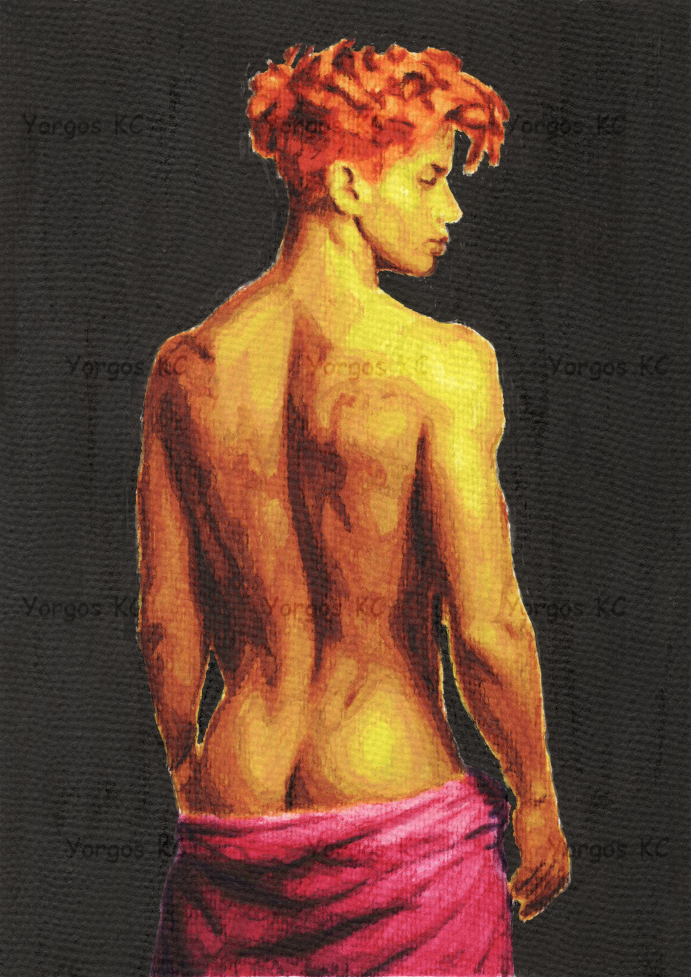
You may have already seen him in his Gallery post, or the Alcibiades post. And if you haven’t… well, there he is. Just to be clear, this is not the first piece I made with this combination. It’s the currently last one, actually. I only use him, because he is already in my Gallery, while the rest (successful ones) will be uploaded when I reach them chronologically.
More importantly, the strong yellows, oranges, reds and – of course – pinks are much closer to the kind of saturation I naturally want when I’m working with colour, while the watercolour still gives the painting a character quite different from what I’d get from oils or acrylics.
But here is something I find rather amusing. If you look closely at my brushstrokes, I think they give me away as an oil painter. They go in different directions and sometimes have rather sharp edges – habits I’ve apparently carried with me from oils into watercolour.
So, even when the Bunny ventures into enemy territory, he still brings some of his old weapons with him. 😇
Back to my topic! Fair warning, if you try these watercolours, they dry very fast, so make sure you finish each “spot” before they do.
The Supreme Watercolours?
So, does all this mean I’ve discovered the only combination anyone should use for watercolour?
Of course not!
Then, is it maybe that Derwent INKTENSE and SINOART paper are objectively the best combination there is?
Nope!
Artists have been producing extraordinary works with traditional watercolours on all sorts of papers for centuries. Other artists may try exactly my combination and hate it. I may try the materials they adore and produce something that deserves to go directly into the bin. Been there, done that! (Repeatedly 😌)
That’s the most important point.
Sometimes a medium doesn’t work badly. Sometimes we and the medium simply don’t work well together – or we haven’t yet found the materials and methods that make it work with the way we think and create.
I’m still not going to declare my eternal love for watercolours. We have far too much history for that. Not to mention that I love too much oils and pencil.
But perhaps the Watercolour Monster and the Pink Bunny can coexist peacefully – even if wary of each other – after all.
That’s all. Have fun, be creative, and paint nudes with whatever medium works for you.
Love and Kisses,
Yorgos KC


Absolutely gorgeous! Your mastery of the art has come a long way. Bravo. 🙂
LikeLiked by 1 person
Thank you, Meeka!
😘💖😍
LikeLiked by 1 person
LOL! A very honest and lively reminder that reminds all that success can be developed as long as we strive to attain our goal! A very creative accomplishment that you have provided for us to admire. With practically no artistic abilities, I admire your creative spirit and your work! Keep at it, my friend! Great job! 😉 Naked hugs and much platonic love from us both!
LikeLiked by 1 person
You make me blush to the roots of my hair. 🫣
Thank you, very much!
Love and kisses to both of you!
💖💖💖😘😘😘
LikeLike