Before starting, a small warning: There are nudes in the post, so go on, only if you are okay with this.
Some of you might know that I’ve started drawing, not as long ago as it feels, and you might even know I’ve started painting, too. Overall, I must admit, I’m quite pleased with my progress, for now I can draw or paint my favourite subjects in a way that pleases my tastes 😁. Of course, I want to get better, and practice, I believe, will get me there eventually. But that’s not the subject of this post.
Drawing has helped me with painting a lot, and, to my surprise, painting has improved my drawing, too. Drawing with pencils gives you much better accuracy, and you can re‑measure what needs correction any number of times. But this can’t be done with painting — especially when painting a body in oils. Painting taught me how to blend the shadows better but also forced my perfectionist mind to abandon accuracy in some places, and, to an even greater surprise, I found out that this could still look “right”. Of course, some places need some accuracy, but, as it happens, extreme accuracy isn’t necessary everywhere. 🤯
As I need to rely a little more on my eyes instead of my ruler for oils, I wanted to practise a bit more on understanding how the blending of the shades can be done. I thought I would use charcoal because you can smear it more easily than pencil, somewhat mimicking oils. So, my initial idea was to draw a human body by only blackening the dark places with charcoal and then smudge/smear/whatever the right word would be towards the lighter parts, to actually form the body. Once again, this was the original idea, but things took me elsewhere 🤣
Since it was for practice reasons only, I used a photo of myself — a really rare one where the face is actually in the photo. Yeah, I usually frame it outside the photo. Anyway! So, I started as I intended to and took a break after blackening the dark places in order to work on it afterwards.
And then, when I looked at it after the break, I was surprised and astonished. “Bloody hell! I look hot!” And this is not what I usually think when I see my image 🤣. And that’s how I started forgetting what I intended to do and began experimenting with something completely new. Just to let you know, I’m not usually very fond of minimalism, which made the whole thing even more surprising for me.
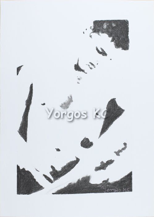
By the way, did you spot the bunny‑shaped shadow on my chest? It is a real one. It’s caused by the irregular lighting and the position of the body, but it exists. I had never realised it looked like a bunny until I outlined it for this drawing. 😁
So, charcoal looked good. But because I’m using charcoal sticks, my accuracy wasn’t great in some small places. Also, since I was using only medium‑hardness charcoal, there weren’t any tones. Well, that was the intention from the start, of course. But, now that I was thinking of working on this — let’s call it a “style” — I thought that maybe I could have two tones of dark.
And so, I made the same picture again, but this time with pencils. I used only two pencils, a 4B and an 8B. The dark parts of the environment and the darkest parts of the body were done with 8B (over 4B, of course, because otherwise there would be many white spots) and the lighter dark parts of the body were done with 4B. The light parts of the environment and the light parts of the body remained white.
I liked the outcome more than the charcoal version, I admit. But I thought it might look good with a transparent pink layer of acrylic on top of it. So I did that — and the outcome was worse than the original. Unfortunately. 🙄
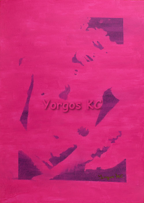
The worst thing is that the two black tones look almost the same, and one should try hard to spot the difference. That’s not how it looked before the acrylic. The other problem is the way I applied the acrylic paint. This is paper, and acrylic doesn’t really slide well on paper. It should have been properly prepared to achieve that result. Oh, well! 🤷♂️
So, this part of the experiment didn’t end the way I had it in my mind. I might try it again, this time correctly, and see what I manage — but not right now. What this showed me, though, is that this tiny bit of extra detail — the two tones of “black” — was something I liked.
Oh, yes, the two light spots in the hair are, in fact, the result of dust particles on the lens. I liked the effect they produce, so I tried to keep them, but the next experiment practically destroyed them and, from then on, I didn’t try to keep them.
Back to my subject now. I thought I wanted a bit more detail, but not enough to make the picture look like an intended‑to‑be‑realistic‑but‑failed kind of thing.
So, maybe let’s keep the two tones of dark on the body. And maybe separate the body from the environment. 🤔
For this one I decided to use colour pencils. For one, it’s easier to create distinctive “tones” by means of different colours. Another reason was that I wanted to test some new colour pencils I had been introduced to and see how they work for me.
So, I decided to leave the light parts of the environment paper‑white and make the dark parts of the environment black. Then for the body I used a pink (surprise!) for the light parts, a purple for the lighter dark parts and a reddish brown for the darker dark parts, and ended up with the following picture.
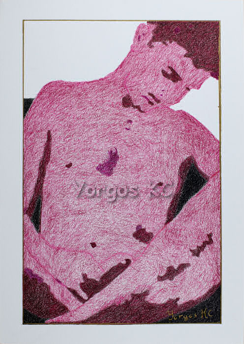
At the very last moment — that is, after actually drawing the whole thing — I decided that maybe I wanted to separate the body parts from each other too, but not intensively so. Therefore, an outline of the body parts was added. Also, the golden border was added because without a border it looked plainly wrong.
I actually liked the result. The coverage of the colour pencils is not perfect — not even close to perfect — but it would need many more hours to make it perfect, and this was an experiment, so I didn’t see the need for it. I also like this effect, to be frank, and since this was done for me, why shouldn’t it remain like this?
About the colour pencils themselves, they are good. They are softer than the ones I use, so they blend better with each other. I can control them a bit less, though. Overall I’m happy with them, but I think I’ll continue using the ones I control better for now. If I ever decide to make colour pencils one of my primary media, then I’ll give it a second thought for sure. So, no regrets for buying them. Quite the opposite, in fact. And thanks for introducing them to me, Shawna! 😘😘
Inevitably, the next step would be done with oil pastels. My intention was to follow the colour‑pencil example with a medium that I use more often than colour pencils, and also to colour the light part of the environment and use, for the body, some colours closer to skin tones. And that’s what happened:
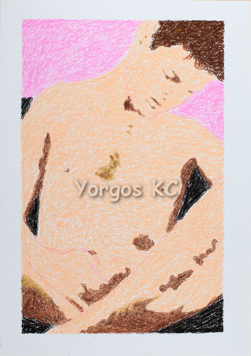
Yes, I can make the pastels much smoother, but, as I said for the colour pencils too, I like this effect. And I actually like this version much more, although there is a mistake in the inner outline. Don’t ask me how I made it. I don’t know 🤦♂️
Oil pastels, just like charcoal sticks, are not good for fine details (in my hands), but there are ways to overcome that, in case you are interested. White spirit can dilute the pastels and make them practically oil paints, and, depending on how soft your pastels are, linseed oil can do something similar. 🤓
Instead of using white spirit or linseed oil to fix the oil‑pastel version, I decided to repeat the experiment with acrylics. There is a reason I didn’t choose oils, although I prefer them. But first, here is the acrylic version:
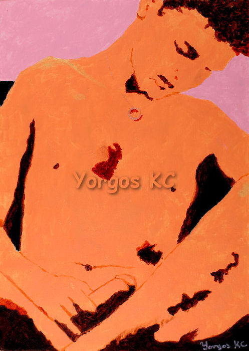
Although it follows the oil‑pastel idea, there are a few more details. The cropping, too, is a bit different, because the photo’s ratio is 1:2, but the A‑series ratio is 1:1.414, and I wanted to use the whole sheet, which is an A3.
Regarding the extra details now: until now I regarded the arm and the hand as a single body part. Here, each finger is considered an individual (and yes, I have, indeed, five fingers, but one is covered by the leg 🤣). There is the belly line, too. Also, you can now see what causes the irregular shadows right under the neck. And, finally, because I like glitter, I used a glitter acrylic medium to paint the places where the light was strongly hitting it. For some reason I missed the other shoulder 🤷♂️.
This glitter medium was the reason I didn’t use oils. I have metallic oil paints, so I could do the ring and the chain, but I would have had to use metallic paint instead of glitter. As you see, the difference isn’t obvious, so there isn’t a reason to be equally reluctant next time.
Now! This I like. This is something I want to work with and experiment with, and I’ll do that. Not right away, but before explaining my thoughts about the future, let’s finish with the past 🤣.
You might think that by now I had lost track of what my original goal was, but not really, yet! So, yeap, I needed to get crazy, and I did.
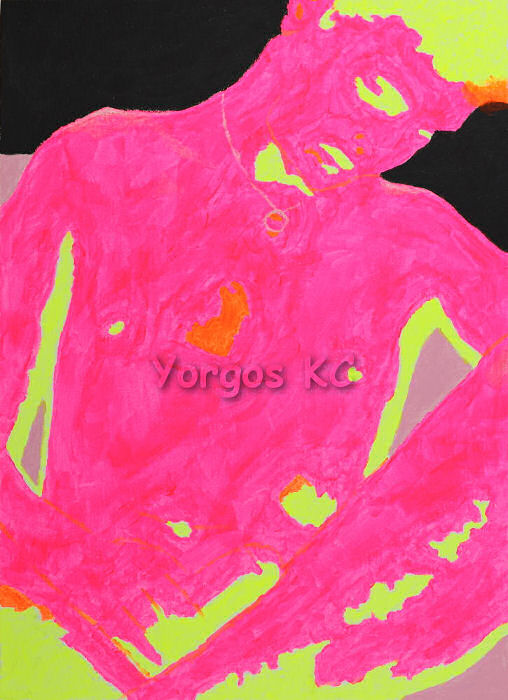
These are fluo acrylic paints — the ones that are luminous under black light. The environment’s paints, though, are plain acrylics, so those would be invisible under black light. I don’t have a good black light, so there isn’t a photo that shows the effect, but yep, I saw the painting under a bad one and it was… well… as crazy as it should be. 😁
Compared to the previous acrylic painting, this one is simpler because of the paints. I’ll be honest: those paints are very difficult to use. They are supposed to be semi‑opaque, but they are very transparent, in fact. That’s why you need to work from light to dark and, believe me, this yellow against the white sheet was very difficult to see.
This is the first time I’ve used these paints, so it was an educative experience. I need more practice until I can utilise them properly.
The main difference in this version, though, is that it is something like a negative image, and on this, I think, I’ll be working soon. By “negative” I mean that the lighter parts are presented darker. You can easily see that the light part of the environment is now black, while the dark part of the environment is pink. Believe it or not, this is the very same pink I used for the light parts of the previous edition, but it looks very different because of the surrounding colours. In person, too, it looks just like that. I made sure to use a proper white balance for these photos.
While I was making this one, two more ideas — even crazier than this — came to my mind, and I intend to make them. I will, in time, but those will be for my enjoyment rather than for experimentation and for the possibility of using the results for other images. I haven’t made them yet, due to time, obligations, and my desire to work on some other things.
Anyway! What am I going to do about these?
I intend to experiment with charcoals and pencils (have started, actually) on other pictures, in order to find out where and how this “style” can work. Because of my conclusions, though, contrary to what I’ve done with my photo, I’m now outlining the body and the body parts. I also try to use three tones: one for the dark parts of the environment, one for the dark parts of the body, and one for the lighter dark parts of the body. Any more tones with charcoals or pencils will start making the drawing look like an attempt to make it realistic. So, why use charcoals and pencils?
Because it’s simpler and cheaper 🤷♂️. I also have plenty of not‑so‑good colour pencils I can use if I want to use colours for some experiments. The not‑so‑good colour pencils are from several sets I tried and, although they aren’t bad, they aren’t as good as the ones I mainly use. The bunny in the title picture is made with such pencils. Of course, if something is worth the effort, I’ll use better means, but, for a start, charcoals and pencils, I believe, will give me an idea of what this “style” can do and what it can’t do, and whether I want to work more on this or not.
In case you were patient enough to read this not‑so‑short post, first and most importantly: thank you! And also, any thoughts would be very much appreciated.
In any case, have fun, always be happy, and keep smiling. After all, nobody has ever fallen in love with a frown!
😘💖😘😁


Wow…so much work! Of all of your experiments, I think I like the very first one the best. It’s very flat but the lack of toning gives it a wonderful, surreal effect in which details like the eye take on more significance. That said, I’ve always like black & white and charcoal drawings. 🙂
LikeLiked by 2 people
Thank you, Meeka. 💖😘💖
The first one is one of my favourites, too. After all, if it wasn’t, the rest wouldn’t come to be 😁
And I think you are right. It is indeed surrealistic! 🤓
LikeLiked by 1 person
lol – very true. It is the ‘alpha’.
LikeLiked by 1 person
I find it fascinating to follow your experimental process from one medium to the next. So glad you’re having such fun exploring all the possibilities & I am, as ever, wowed by the results so far!
Love the *bunny shadow* & the cute bunny heading this post! 😊💖
LikeLiked by 1 person
Thank you, Rosetta! 💖💖😘
So very glad you like the bunnies! 😁💖
And, of course, I must admit, even more so for liking the results of the experimentation. Thank you! 😘
LikeLike